I feel a silent movie, when done right can be more powerful that a heavily dialogued movie.
So I planned to use inter titles which were at first, just what I was looking for. The contrast from the aggressive, rude, violent things the father said, with the simple black text and border speech worked well for a time.

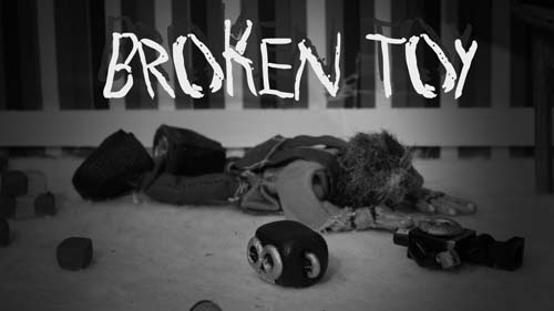
But after watching my first animatic back, it just did not portray the feeling I was after. The traditional inter-titles could not portray the anger and violence of the father quite as starkly as I intended. Someone suggested I look at the text sequence from the Se7en movie designed by Kyle Cooper.
This text has a more gritty feel. The scratched look, the fussy pulsing, and almost screeching text was perfect inspiration.


No comments:
Post a Comment