I decided that dialogue sound was not needed in my movie as the music and atmosphere would be enough to carry the movie without needing heavy dialogue. I feel a silent movie, when done right can be more powerful that a heavily dialogued movie.
So I planned to use inter titles which were at first, just what I was looking for. The contrast from the aggressive, rude, violent things the father said, with the simple black text and border speech worked well for a time.
But after watching my first animatic back, it just did not portray the feeling I was after. The traditional inter-titles could not portray the anger and violence of the father quite as starkly as I intended. Someone suggested I look at the text sequence from the Se7en movie designed by Kyle Cooper.
This text has a more gritty feel. The scratched look, the fussy pulsing, and almost screeching text was perfect inspiration.
As this movie is about child abuse it was only fitting I started by looking at anti child abuse videos such as the adverts presented by NSPCC. Thinking back to NSPCC advert I had seen on the telly the one that stuck in my mind the most had to be ‘Cartoon Boy’ produced in 2002 which features the punchline ‘Real Kids don’t bounce back
My movie needed to have a dark undertone; it should be dark and foreboding in order to tie in with the subject matter. It had to have something that didn’t quite sit right with the eye and made the viewer feel uncomfortable but compelled to watch it. I looked to a range of movies for inspiration with this such as The Shining, with its stark pattern designs on the carpets, Sweeny Todd for its dark and dingy Victorian feel and Tim Burtons Vincent
Looking at this poster of Sweeny Todd got me thinking about stripes in horror movies. This is not a pleasant patten to look at, especially within a small space. Strong patterns like this can be claustrophobic and these stripes to me, give the impression of prison bars, a creepy prospect. This gave me the idea for the design of the living room in my set.
With Tim Burton's Vincent, I have found that the atmosphere is enhanced by the lighting, and the large stark shadows. The set is daunting and insane, like the mind of a crazy man had designed a room just by thing about it.
I have also noticed with this animation that a childs perspective is presented by the fact that the mothers face is never shown, she is too tall and out of shot.
To produce a set as wacky and insane as that set used in Vincent, would surpass my current skill set, however I aim to create a similarly disconcerting atmosphere. After watching this movie I knew that black and white would also be appropriate for my film. I also decided that dialogue sound is not needed, as I want the visuals to speak for themselves but I will use haunting music.
Now that i hade a idea of what my living room would look like it was time to think about the hallway decor. I did not want the hallway to look roomy or light. I wanted it too look closed in and small so that it was almost funneling you out or into the house. I remembered that scene in The Shining with the two twins standing in the corridor. This a very creepy scene.
When initially stuck with an idea for my movie, I looked to my own past experiences for inspiration. Thinking back to my childhood, I experienced verbal abuse and bullying first hand. Although this meant dragging up some bad memories, I decided it gave me a powerful subject matter for an animation. Whilst my piece is designed to present the worst-case scenario of child abuse, which I did not experience, I will use my history to bring emotion to the piece.
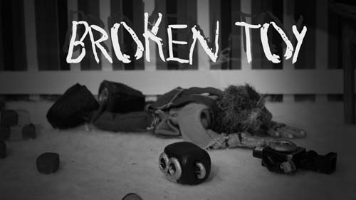
The idea behind my movie documents a small child who is both verbally and physically abused by his violent father. The neglected child is depicted as a rag doll; tattered, shabby and unloved. His physical form shows both the bodily and mental scars he endures. He also has a favourite toy, the only thing that he loves, that his father breaks. These two elements inspire the name of the animation, as ‘Broken Toy’. At the end of the piece the neglected child is rescued by the social services. Through these details, I aim to show a troubled situation without using overly graphic or crude references.
Sunday, 18 January 2009
I am very happy with the overall look of my set the furniture and fittings look very realistic. The dark mahogany wood with the striped wall paper work really well together and make the room look really small and cramped which is just what i was looking for. The dark tones I will be able to get from this set when film will be much to my advantage as it will be filmed in black and white so the textures play a very important role in the final look of each piece I constructed.